Product Labels
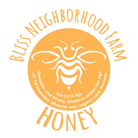
Looking for more design practice, I decided to revamp my father’s jar labels. He keeps bees and a garden as a hobby which yields a substantial amount of raw honey and fruits suitable for canning. For the past few years he has been printing out a basic informational label for the jars of jam and honey he makes, but I felt that I could give him something better.
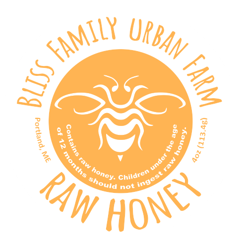
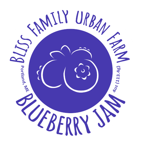
The challenge with this project was to keep the label simple and attractive while still providing all the information the originals provided. I decided to go with a single, bold color design for most of the labels with each color reflecting the food inside the jar.
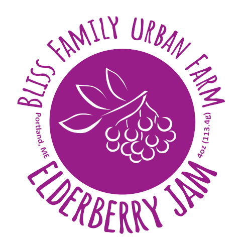
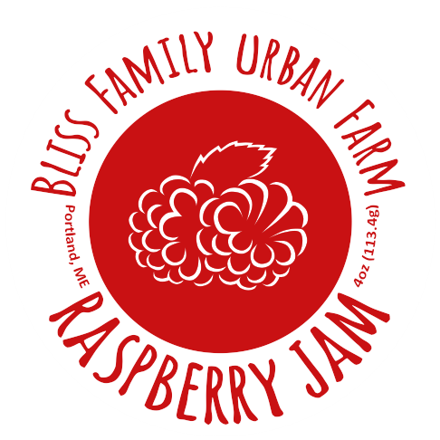
The only exception was the mixed berry jam. I had wanted this label’s color to be a mixture of the raspberry, blueberry, and elderberry label colors; just like how the jam was a mixture of those three fruits. The resulting color was rich and dark but didn’t seem distinct enough when compared to the elderberry; so, I decided to make the interior circle of the mixed berry that dark purple color while making the outside font switch between the other three colors, helping distinguish it from the two other purple labels.
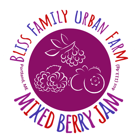
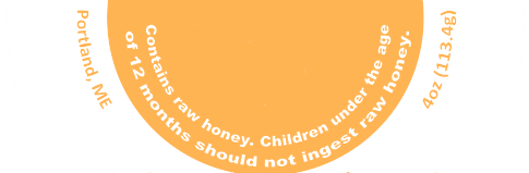
I chose Calibri for the fine text that makes up the weight, location, and warning info.
This was partially because it is easier to read when it’s small and partially because it is built into the add-text function of my drawing software, so the process of creating different text for the different product sizes and getting them to match the curve of the label was super simple and fast.
For the larger text I wanted a font that felt somewhat like a hand drawn label while still remaining readable and simple in appearance.
The final version uses Amatic SC as a base; however, I couldn’t use that font directly in my drawing software. Because of this, I had to recreate the Amatic SC characters by hand as individual vector shapes. This was a little bit more work, but I feel the results were well worth it.

The final step was adjusting the design based on feedback. While he liked the labels in general, there were a couple alterations he wanted. First, he preferred the name “Bliss Family Urban Farm” over “Bliss Neighborhood Farm.” This was easy to fix, as the words “family” and “urban” fit nicely in the same space “neighborhood” did, so no major adjustments were needed.
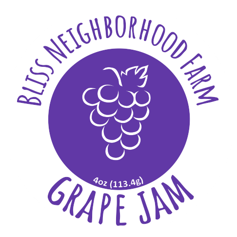
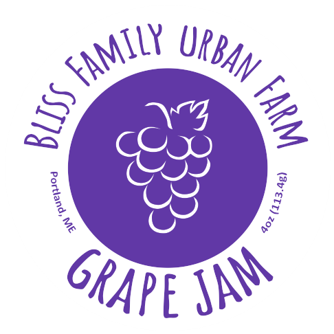
The second adjustment required a little more thought to get right. My father wanted the general location somewhere on the label and also insisted that the honey be labeled “raw honey” as it had not been pasteurized. After a bit of tweaking, I decided the most appealing place to put the info was along the outside of the label’s central circle rather than try to cram it all in somewhere on the inside. Besides, the honey label’s interior was already filled with extra language warning the consumer about the raw honey inside. This way, all the labels maintain the same information in the same locations as each other.