I was commissioned to design some posters for my local community theater’s upcoming season of shows. Below are the designs as well as some of my thought processes behind the designs.
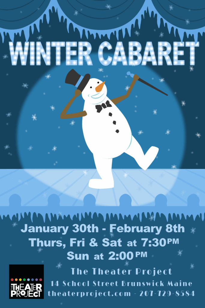
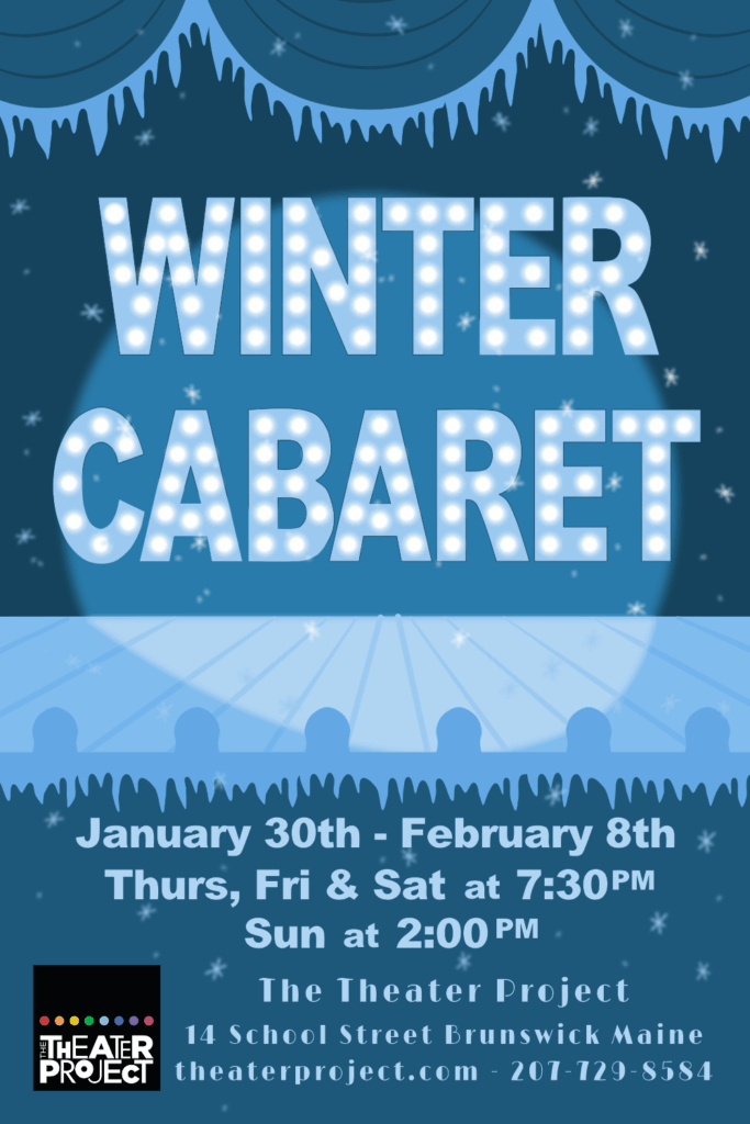
I started with the Winter Cabaret poster. My initial design, on the left, had the majority of the final design’s features but the theater’s director asked if I could remove the snowman performer from the first draft. The didn’t say why, but looking at both I think the final design on the right is clearer with the larger text while still keeping the theme of a winter-coated stage in lights.
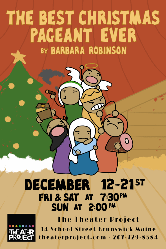
Next I worked on the poster for The Best Christmas Pageant Ever. It’s a fun show about six hooligan siblings who get involved in their town’s Christmas pageant. I decided I wanted the poster to ride a line between being readable and looking as though it were drawn by a child. I went with simple shapes and used my graphics software’s ability to create randomized textures within a vector to add a scribbly crayon-like look to parts of the foreground characters and much of the background.
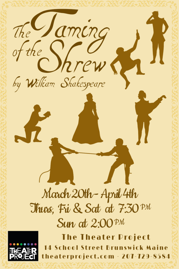
When designing the poster for The Taming of the Shrew I was a little more lost with what to depict. I had thought about doing some sort of view of an Italian courtyard where much of the story takes place, but nothing about it seemed particularly interesting and didn’t help show to a potential reader what the show was actually about. I decided to go with silhouettes depicting characters from the play doing something that highlights a little bit of their character. In particular, at the center of the poster I wanted to depict the two sisters central to the story and the kind of situation they find themselves in. The character Bianca is caught between two suitors: Lucentio and Petruchio. Both pretend to be tutors, one of Latin and one of music, in order to get past her father and woo her. Meanwhile, Katherina, the titular “shrew”, becomes engaged in a psychological bank-and-forth with her new husband Petruchio, which I decided to depict visually with a tug-of-war.
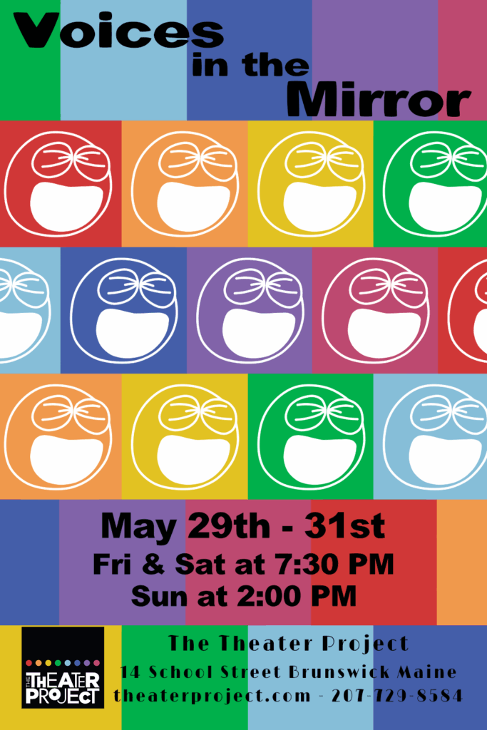
Voices in the Mirror is a yearly occurrence at the Theater Project. It is a teen comedy sketch show written by and starring high school age kids. For this poster I knew I wanted to include the same laughing face design that has been included on most of the posters from years past. Initially I toyed with the idea of including the faces in colors mimicking the nine colored pips in the Theater Project’s logo but the initial design had way too much black with only a tiny bit of color. It just wasn’t silly or fun enough to really grab attention. Then I started playing around with an inverted white face over colored blocks and landed on the design on the right, with colored blocks tiling across the poster in the same rainbow sequence they appear in the logo. Offsetting the blocks by half each row helped to keep the poster from looking too much like a checkerboard and the faces helped add some visual interest to the center of the poster.
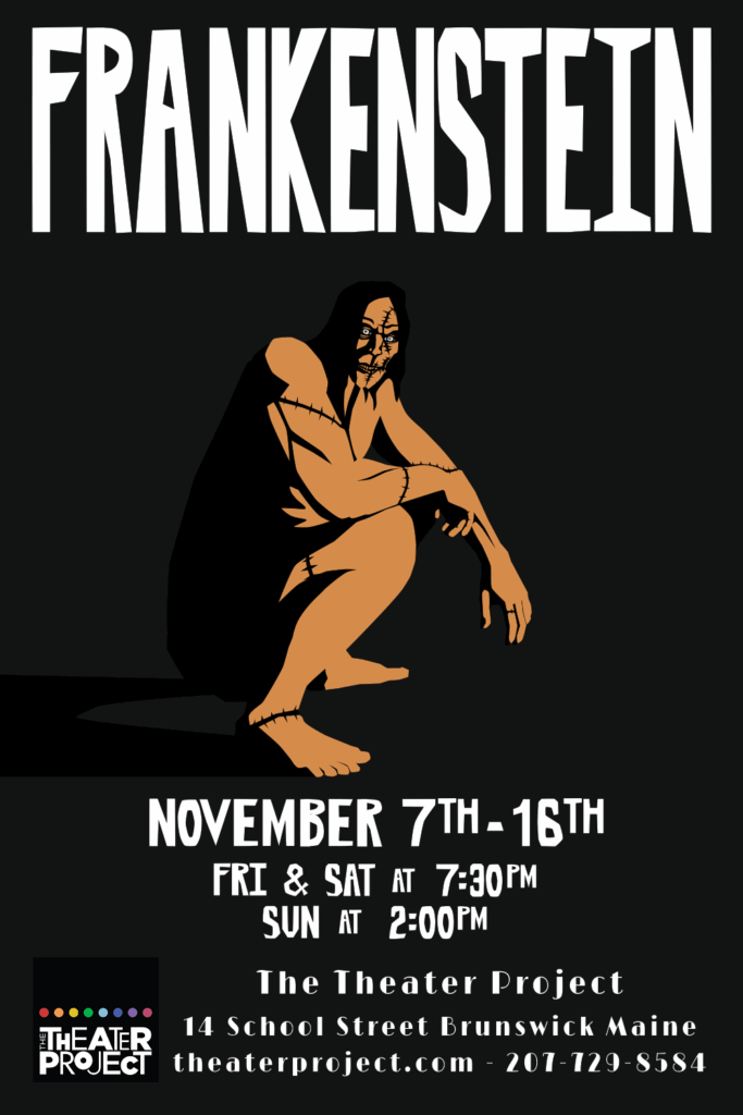
Finally, there was the poster for Frankenstein. I love the story and the Frankenstein’s monster character, so I was especially excited to work on this one. My initial ideas involved stylizing some of the moments when Victor Frankenstein comes face-to-face with his creation. My first idea was to depict the Monster out on the Arctic ice, a dark figure larger than a normal man set against the desolate cold wastes. Next I though about the Monster meeting Frankenstein in the Alps, with the Creature emerging over the crest of a hill looking down on his creator. The second idea was a little more fully formed and I liked the possibility of making the poster in the style of an old horror movie. However the layout just wasn’t coming together and I was a little unsure if the tone of the poster would work with the tone of the show. I ended up with a more simplified design depicting just the creature in the harsh dark lighting of a campfire. I wanted viewers of the image to feel a number of different things: The Creature is large and muscular but posed squat and turned away from the viewer. He feels potentially dangerous but also a little bit sad or pitiable. The harsh lighting fractures his body, cutting him into pieces with dark shadows and highlighting the deep cuts where his sutures are. He is alone, left to sit by himself in the dim glow of a fire he had to learn to craft himself.