Podcast Branding
In 2018 I had decided that what the world needed more of was a podcast, a Dungeons and Dragons podcast to be specific.
Now, I love tabletop roleplaying games; but for some reason I had decided that I was ready to not only start running my own game sessions, but to also record those sessions, edit the audio from them, create sound effects and background music, and design the branding for it.
Obviously, this lasted only a few sessions before the immense workload and difficulty in scheduling left the project dead in the water, but I did manage to flex my design muscles a bit along the way!
The basic idea behind the branding was to mimic the look of an old book.
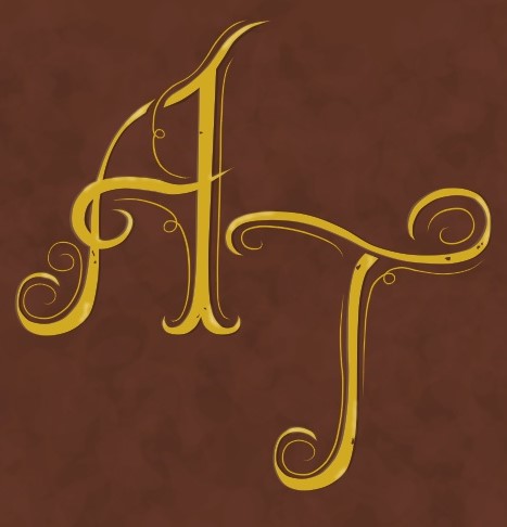
For the profile picture, I went with the idea of a gilded leather book cover featuring the initials of the podcast’s title Another Tale. I started by picking the colors I wanted, in this case a golden yellow and warm, reddish brown. For the style of the font, I tried to emulate the look of both fancy calligraphy and the historiated initials you might see at the beginnings of chapters in an illuminated manuscript.
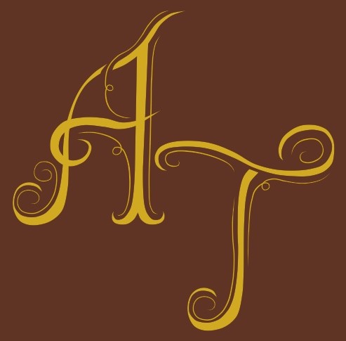
While I was happy with the choices I settled on, the result was still lacking something; so, I decided to add some texture to the gold and leather. I added an extra layer on top of the brown background comprised of a random spread of overlapping, rounded, blurred shapes. Some of the shapes were slightly darker than the background color, creating a mottled texture that I think helps suggest leather better than the base brown background. For the gilded lettering, I added some faint highlights for a bit of luster and a couple of specks of brown at certain points to add a bit of wear, as if bits of the gold lettering were beginning to flake off.
Ultimately, this image was going to mainly be seen in thumbnail form, so I didn’t want to spend too long adding details that would get lost so easily. I feel like it was worth it to add a little texture, however, for the short time it took me to add.
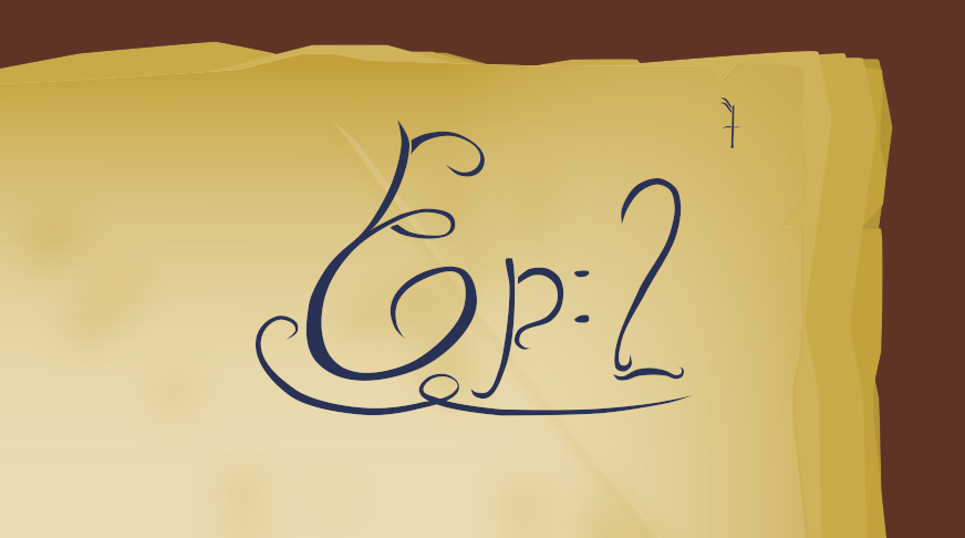
The next thing I designed was the format for the individual episode thumbnails.
To fit with the book theme, I wanted them to resemble chapter headings. I even toyed with the idea of calling the episodes chapters in an early draft only to quickly discover that, given how small the thumbnails appeared when uploaded, words like “episode” and “chapter” became hard to read in anything other than thick, bold fonts. Since I really wanted a fancy cursive font, I eventually settled on the shorter option: “episode.”
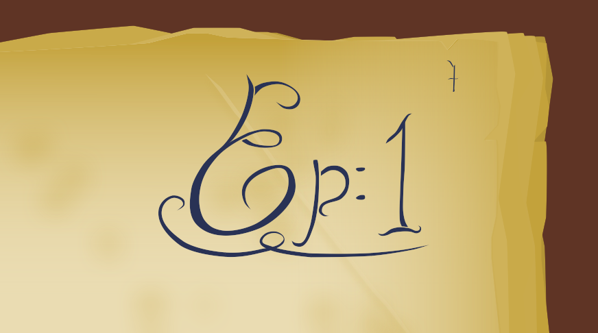
The pages themselves are basic gradients to give the impression of a piece of parchment yellowing at the edges. I also included some faint spots of darker smudged color to add texture as well as a thin diagonal line to imply a crease at the page’s corner.
Finally, there was the full title image. I tried to carry the design I had given the capital letters over to the lowercase ones. Each letter has their thicker, primary lines that allow for the font to be read as well as thin, secondary lines that act as decoration and help give the words a scrawling, handwritten appearance while still being a consistent font.
Since the game within the podcast was centered around the players pursuing the antagonist to his desert homeland, I wanted to incorporate some of that into the title. The subtitle was meant to resemble golden runes on a temple wall, while the sand was supposed to look as though someone had blown or brushed it away from the center of the page.
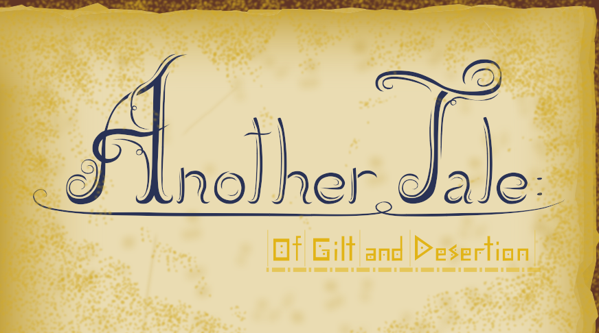
Because I was also hosting this podcast on Youtube, I gave the title a little bit of animation to lead into the start of the episodes. It starts with sand being blown off of a partially obscured main title before the subtitle is revealed through a basic fade-in wipe.