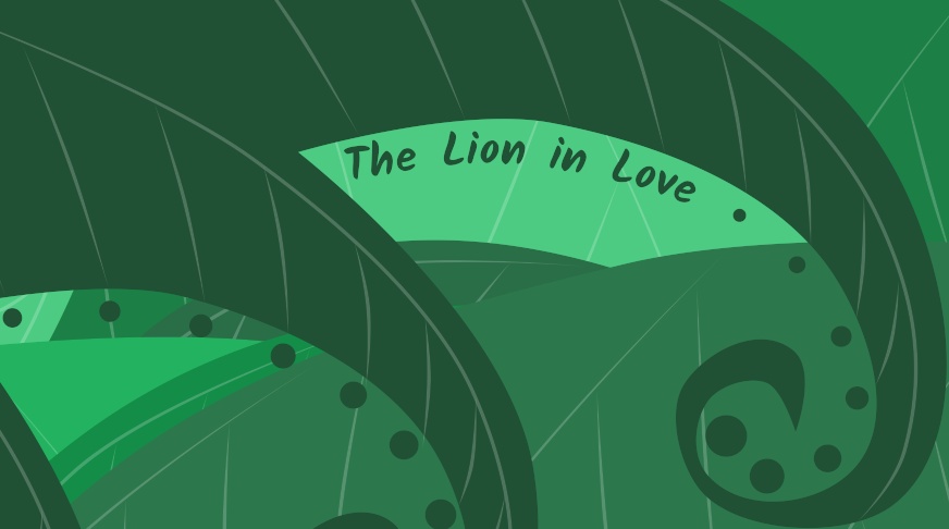
The Lion in Love
In early 2021, I was asked to take part in an online collaboration for The Theater Project. Since the COVID-19 pandemic was still in full swing at the time, the theater was looking for ways to produce content remotely. The basic idea was that each person involved in the collaboration would create or rehearse a piece of content that tied into an overall theme about love.
I hadn’t animated anything longer than a couple seconds since college, so I felt that this was a great opportunity to flex those creative muscles again.
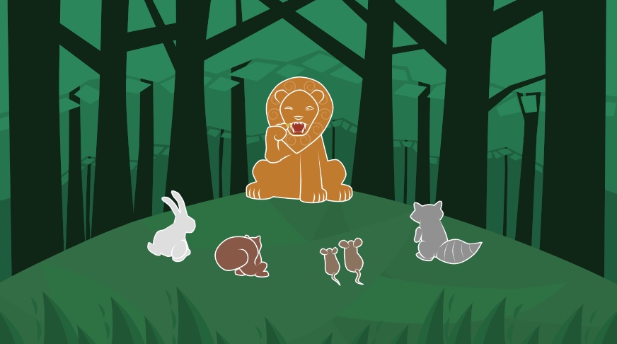
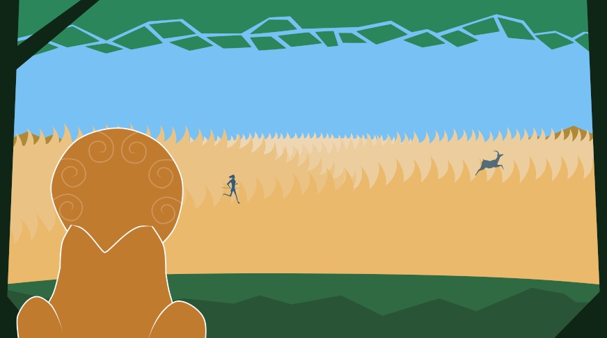
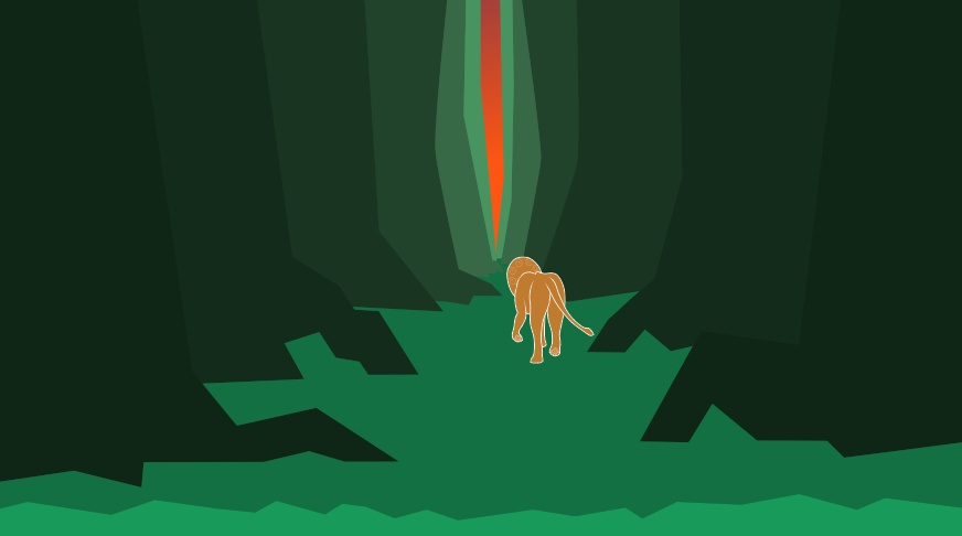
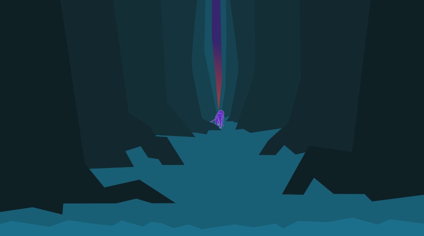
Over the years I’ve found that I tend to prefer simpler shapes in my drawings with lines serving as decoration or accents rather than borders. For the foliage of the forest, this was especially true. I’ve made the mistake in the past of trying to visually define far too many blades of grass or leaves on a tree. For this project, I came up with the idea of showing foliage by having one large mass of green to form the main clump of leaves and then peppering the edge of the mass with smaller, individual shapes. What this creates, I think, is the feeling of a mass of leaves without the excessive work and distracting visual noise of hundreds of individual leaves.
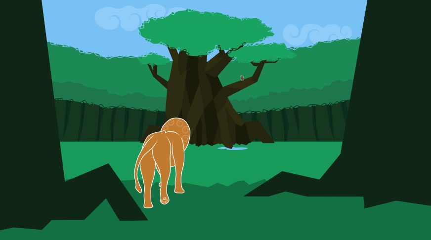
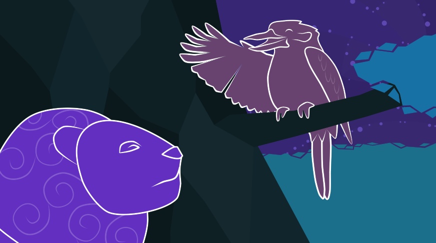
One of my goals for this project was to see if I could create a visual style for the characters and environments that I enjoyed while keeping them simple to draw and animate. Initially, I had wanted the characters to be drawn with the same lack of outline or strokes as the backgrounds. I quickly discovered, however, that even though they were distinct from the background in color, most still looked flat. To fix this, I gave them some linework in white to help them pop out from the scenery.
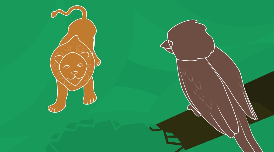
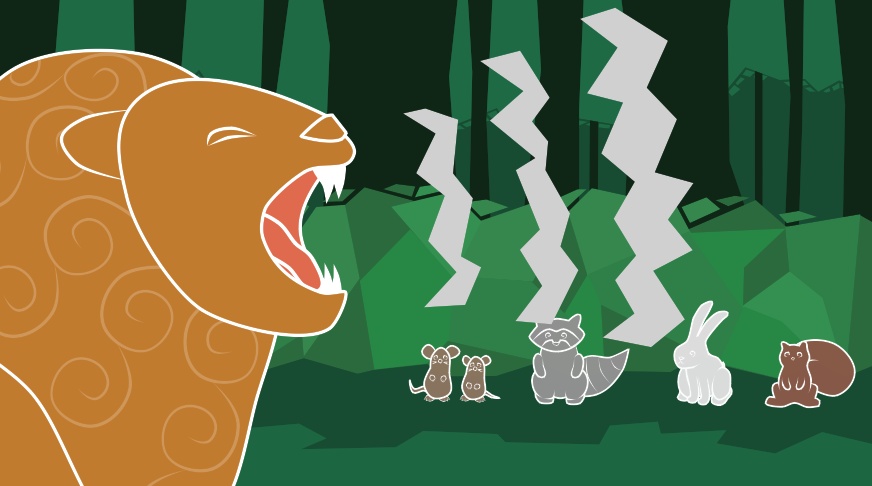
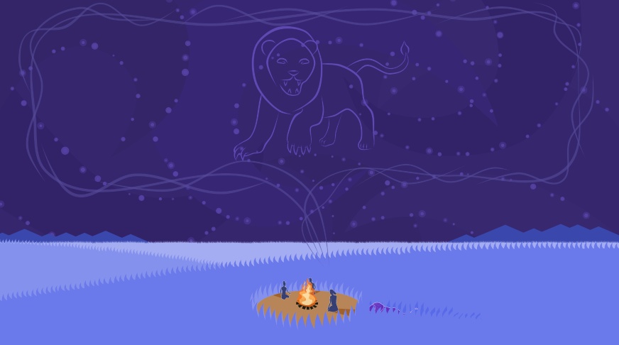
I found the general shape and color of the lion quite quickly and was also pleased to discover that the same color saturation that I had used for the orange yielded a color that I loved for his nighttime scenes when applied to purple. The final addition for the lion was his mane. I had the idea to add light swirls to help sell the image of hair. Without it, his head was looking less like a lustrous mane and more like a strange neck lump.
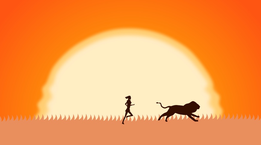
The huntress is mostly seen by the viewer from afar, but for one shot we can see her face as the lion is watching her by the fire. Because she is from a different group than the lion, I wanted her design to emphasize this difference. I gave her much sharper corners and a hair pattern to match. In this way, her sharp shape language contrasts her against the lion’s rounded, curly shapes.
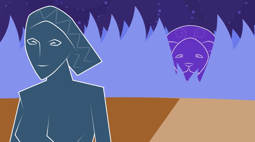
The first draft of the animation had a much more mundane color palette, with colors closer to the real-life objects they were portraying. However, as I worked on the project, I found myself questioning why I was defaulting to natural coloring. Nothing about the story or artwork was adhering that closely to reality, so why should the color palette? Once I got over that mental hurdle I was able to start playing with some really fun colors that allowed me to translate the darkness of a starlit night or the hazy redness of a new dawn to these scenes.
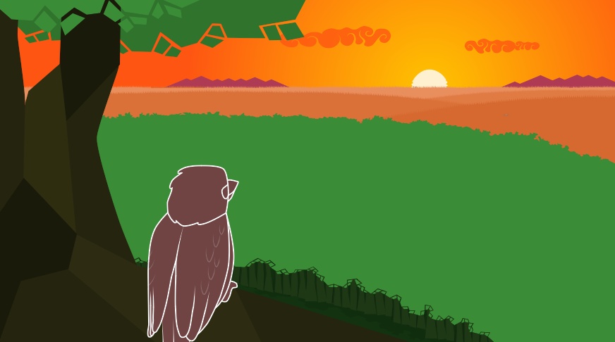
Since these two shots were so short and I was nearing the deadline, I thought it would make sense to use the same staging and perspective but change the color palette to show the time of day. The first version uses similar colors as the rest of the forest shots during the day, but shifted slightly more red to account for the sun setting. The second version uses the same brightness and level of color saturation, but shifts it much farther into blue to help sell the idea of nighttime.
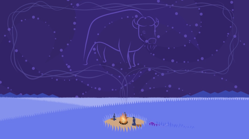
For the nighttime scenes, I wanted something slightly more interesting than a simple splattering of dots for a starry sky. When I had written the script for the story, I had imagined each of the hunters’ descriptions of animals appearing as constellations above them as they spoke. After staring at night sky photos for inspiration, I came up with the sky you see in the animation.
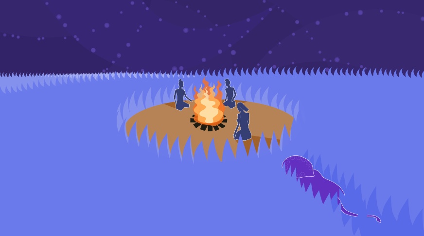
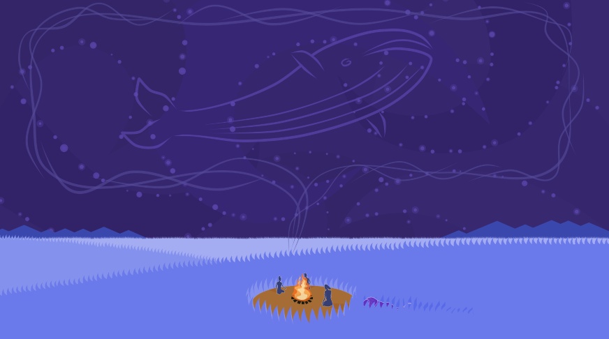
The sky is filled with different shades of dark indigo in wide, sweeping crescents while the stars themselves follow along the inside edges of these shapes. The idea was that the different shades of dark purple give the suggestion of depth to the night sky while also visually breaking up the sky into something interesting to look at.
I’m very proud of what I was able to accomplish with this project in just a few weeks and love the way the final piece turned out!