Film Props
Another small project I’ve completed involved filmmaking. I was asked by a friend to create and gather props for a short film he was helping his brother make. In the film, the main character receives the results of an I.Q. test he had taken. The results clash with his self-image. My job was to take the letter as written in the script and create a physical, official-looking letter that the character would read on-screen.
I decided to go with the Javanese Text font, as I felt it gave off the feeling of an official or informative document like the cover of a dictionary.
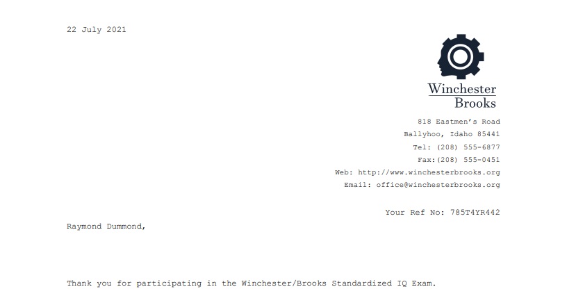
For the logo, I searched up some existing IQ test logos for inspiration and found what you would probably expect for shared imagery between them all: brains, gears, lightbulbs, and human face profiles. I decided to go with the design you see on the right, blending the shape of a gear into the profile of a human face.

If I were to remake this logo, I think I would try to connect the gear/face part of the logo more directly to the business name, perhaps placing it on the right or left side of the names to give it a more streamlined look.
Regardless, they were satisfied with the result and we printed it on to the letterhead of the prop papers. Below, you can see how it looked once it was added to the rest of the letter!