A friend of mine commissioned me to create and style her website for her. The basic idea behind it was to serve as both a general blogging space as well as a place to put out her reviews of restaurants and her experience dining in them as a large-bodied person.
We discussed what she wanted for the look of the website: it should eye-catching and fun, but not so much so that it looks like it is intended for children or a circus.
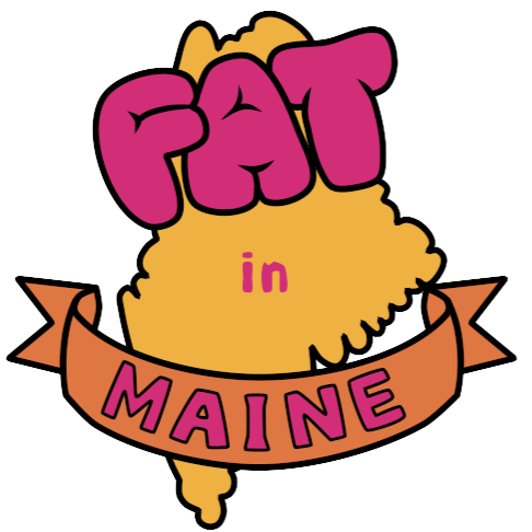
I first drafted up the shapes in black and white. We decided on bubbly letters for the top wording of “Fat” and letters that were in a similar font to those we’d seen on maps for the rest. We put the word Maine in a banner at the bottom to add some more visual interest as well as continue imitating the styles of map artwork.
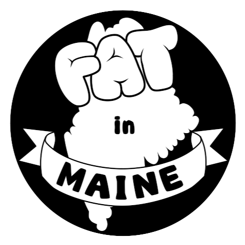
When it came time to color the logo we decided on some warm highly saturated colors. The deep pink would color in the text while the yellow and orange served as coloring for the background. We thought about using the pink in the background, but it proved too dark and distracting when used that way. We also decided to lose the general background circle and give everything a dark, thick border instead, as it would allow the logo to fit into the website more easily instead of sticking out.